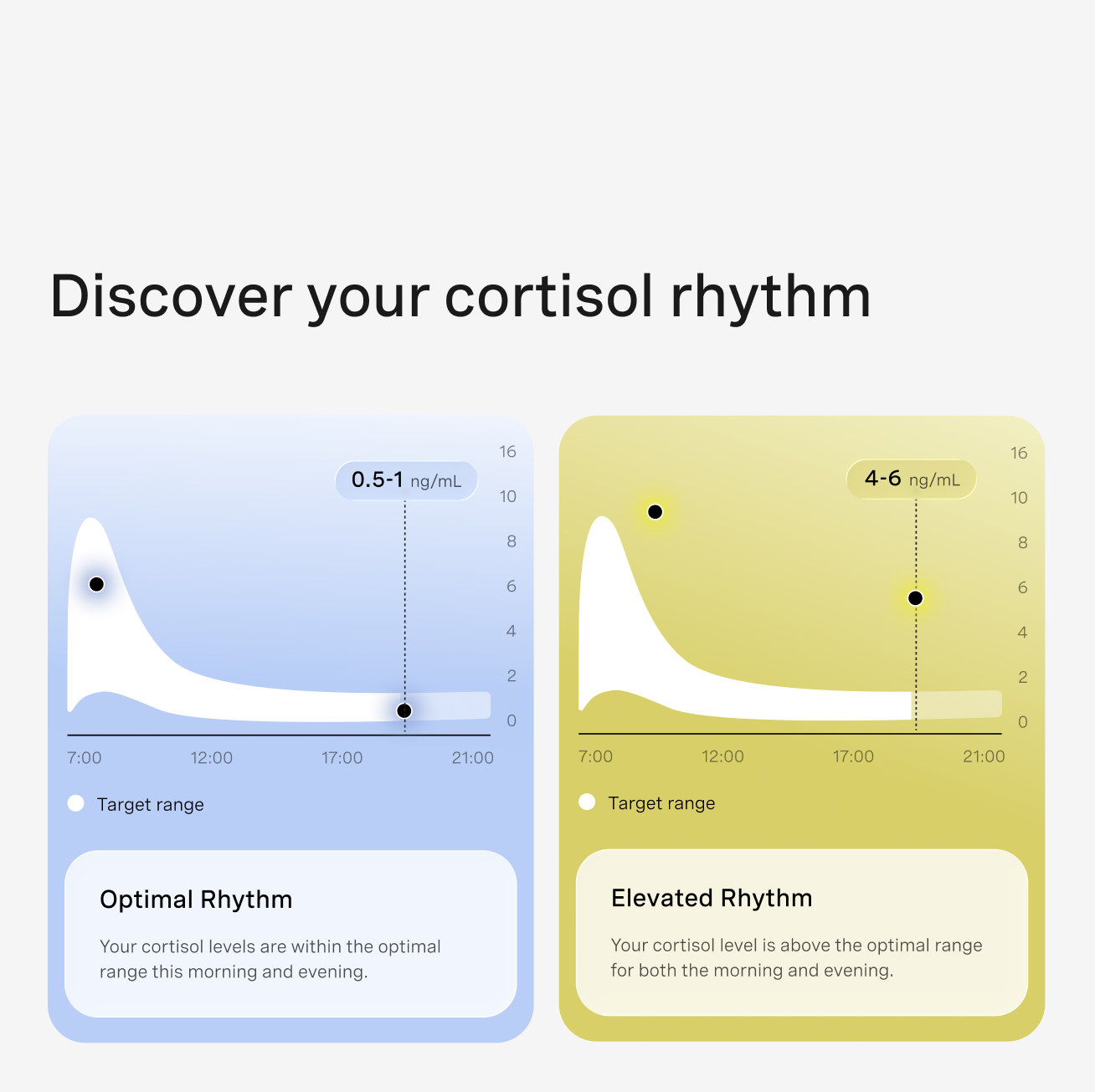
One cortisol measurement is a data point. A full day of measurements is a rhythm. But even one rhythm, on its own, doesn't tell you much. The question people actually want answered is a comparison question: is my rhythm improving, holding steady, or drifting? That answer only shows up when you can put days side by side.
That's what rhythm comparison is for.
Why the shape matters more than the number
Cortisol isn't a level. It's a curve.
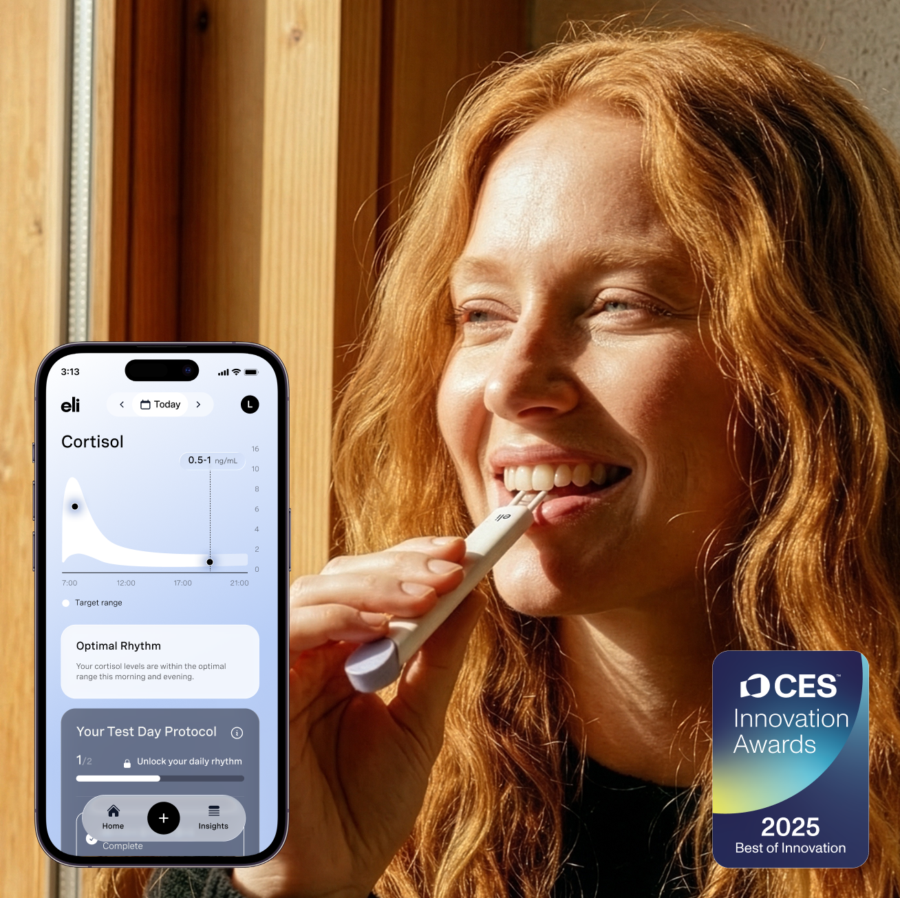
A healthy diurnal rhythm rises sharply within the first 30 to 45 minutes after waking (the cortisol awakening response), declines through the day, and settles to a floor by evening. The shape of that curve, its steepness in the morning, its slope through the afternoon, its depth at night, is what reflects how your system is managing stress, sleep, and recovery over time.
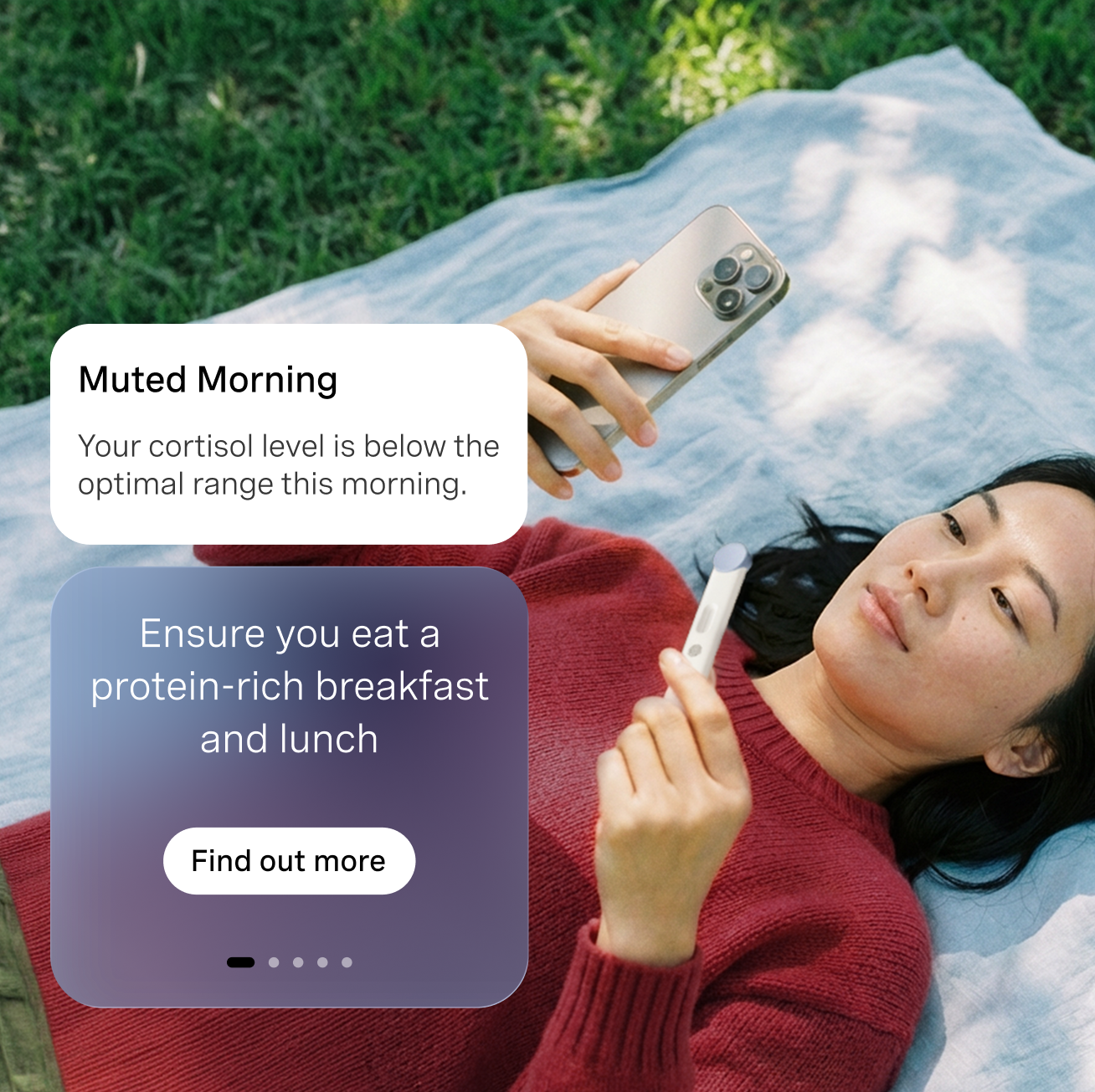
A single high morning value doesn't tell you much. A curve that used to peak sharply and now peaks flat tells you a lot. A rhythm that used to settle by 9pm and now stays elevated at 11pm tells you more.
Reading the shape is where the signal lives. And you can only read a shape by comparing it to another one.
What rhythm comparison does
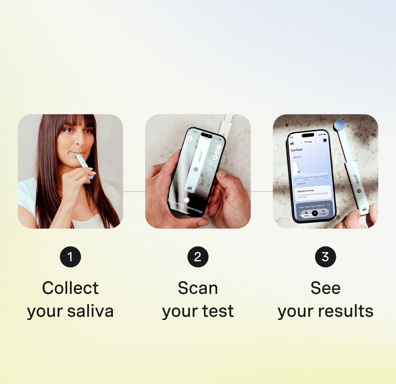
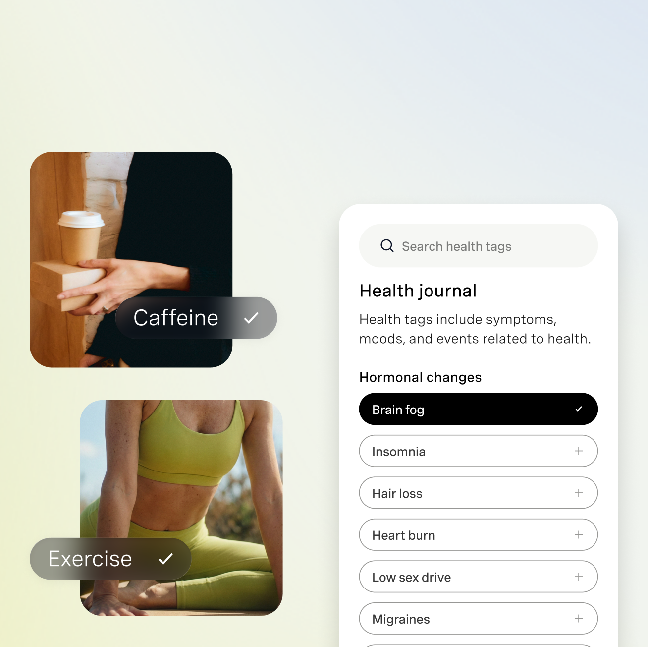
You pick two or more complete rhythms (a morning sample within 90 minutes of wake, an evening sample between 5 and 11pm, both from the same day) and see them together. Target ranges are shown for each time of day. Each measurement is coded as within or outside range. The health tags you logged sit directly under each rhythm, so if Tuesday's curve looks different from Sunday's, the "poor sleep" or "high stress" tag you added on Tuesday is right there.
No jumping between screens. The comparison is the view.
What health tags add
Tags aren't decorative. They're the interpretive layer.
A flattened morning peak next to a "poor sleep" tag isn't a diagnosis, but it is a pattern worth noticing. A steeper evening decline on the days you logged a workout is worth noticing too. Over time, these correlations become the kind of self-knowledge that isolated numbers can't produce.
This is still passive display, you're doing the reading. But the pieces are finally in one place.
What's changing alongside this
Rhythm comparison replaces the Recent Trends section. Morning trend, evening trend, and score trend each surfaced a slice of the picture, useful in their own right, but the full shape of the day is a stronger signal than any one of its parts. Bringing everything into a single rhythm view is the natural next step: same data, more context, easier to read.
The measurement history experience is evolving in the same direction. Instead of scrubbing through individual points, you're now comparing complete rhythms. It's a shift from what was my level at 2pm on Tuesday to how does Tuesday's rhythm compare to last week's, which is the question most people were already trying to answer.